

Double-Struck Font Generator
Transform regular text into mathematical blackboard bold (open-face) unicode text.
A Double Struck Font Generator creates real Unicode text through a mapping engine, turning an input box entry into an output box result. This visual style uses doubled strokes while preserving portable characters across screens.
In practice, double struck text connects mathematical notation with modern digital form, using corresponding Unicode from Mathematical Alphanumeric Symbols rather than an installed visual font. The result supports quick copy functionality across platforms with confidence.
Table of Contents
What Is Double Struck Font?
A double struck font is a Unicode style that gives letters an outlined appearance rather than relying on font files. It uses double struck text characters for distinctive titles, bios, posts, labels, and decorative headings.
Unlike image-based lettering, these generated characters remain text characters, making them easy to copy-and-paste across platforms. The style is associated with mathematical notation, yet creators also use it for social media identity, captions, and emphasis.
How Does A Double Struck Font Generator Work?
A generator usually begins by reading the input, then matching each letter against a Unicode mapping. The interface can preview a styled result, while a copy button transfers Unicode characters for the desired platform directly.
The interesting part is fallback glyphs: unavailable characters may remain normal text or show differently, depending on rendering. Testing across platforms reveals whether special characters survive intact, especially on mobile browsers and common messaging apps.
Also Read: Small Text Generator
How To Use A Double Struck Font Generator
Start by entering ordinary text, then let the generator create a character mapping between your input and standard characters. From my testing, this quick conversion works best when you review each generated result carefully.
Behind the interface, the tool searches a lookup structure for matching mathematical characters, applying Unicode values that preserve the intended appearance across supported platforms. I recommend previewing the output before copying it into your profile.
Benefits / Advantages Of Double Struck Text
Practical benefits include selective emphasis: double-struck text can separate post titles, labels, headlines, and academic notes from surrounding text, improving readability while giving readers an immediately recognizable cue without requiring images, custom fonts, or editing.
In my experience, social media bios, usernames, captions, and editorial projects benefit from distinct branding, while Unicode keeps the result portable enough for everyday workflow needs, enabling reuse through copy tools across a compatible application.
Where To Use Double Struck Text
For social media, gaming, and creative design, double-struck text adds visual impact without font installation. I often use it for profiles, captions, promotional content, and compact labels where visual emphasis improves recognition across platforms daily.
In academic content, technical documentation, and editorial work, it can mark academic notation or distinguish headings. For brands, personal branding gains uniqueness through outlined contrast, while readability should guide placement and consistency across every channel.
Double Struck Text For Social Media
On social platforms, I find double struck text most effective when it frames brief bios or profiles rather than whole messages. It adds decorative text while preserving recognizable characters, especially across Instagram, TikTok, and Discord.
For social media branding, I pair selective double struck words with ordinary text, using Facebook, Twitter, and chat spaces carefully. The strongest results feel intentional, readable, distinctive, and easy to copy without overwhelming the audience.
Double Struck Character Alphabet, Numbers, And Symbols
A character reference helps you inspect uppercase, lowercase, numbers, and symbols before copying. In blackboard bold practice, Unicode-based letters can preserve academic notation while mathematical characters remain recognizable inside ordinary text fields for practical use.
Some set symbols such as ℕ, ℤ, ℚ, ℝ, and ℂ carry established mathematical meaning, yet decorative characters can support creative designs. Testing each variant helps confirm letter shapes, spacing, and compatibility before publishing anywhere.
Double Struck Unicode And Mathematical Notation
Double struck characters are useful when notation needs visual distinction. Their Unicode representation maps familiar letters and mathematical symbols, allowing writers to present set names such as ℕ, ℚ, ℝ, and ℂ consistently online today.
From practical testing, the important point is character mapping rather than a font file. Mathematical forms travel as Unicode characters, so appearance depends on platform support, browser rendering, and fallback behavior across an operating system.
Compatibility And Platform Support
Double struck text generally travels well through Unicode compatibility, but results vary by platform display. I test it across Windows, macOS, and browser-based applications before publishing, because fallback behavior can change individual characters reliably.
On mobile phones, iOS and Android usually preserve supported forms, while SMS and some email client workflows may simplify them. Good character support matters most when unsupported characters trigger ordinary replacements unexpectedly across services today.
Accessibility And Screen Readers
Accessibility testing should begin with the destination platform, because altered rendering can appear when Unicode ranges differ. On macOS, Android, Windows, and iOS, modern versions usually improve support, but legacy characters may still behave inconsistently.
From my testing, removed styling is less concerning than missing characters or empty boxes, which can disrupt interpretation. Check previews across devices, then provide plain-text context whenever a double-struck character fails, especially before publishing online.
Tips, Best Practices, And Common Mistakes
For reliable results, I test platform compatibility before publishing, inspect punctuation carefully, and keep short phrases rather than long decorative passages. I check spacing, character rendering, device behavior, and editor previews to catch inconsistencies early.
A frequent mistake is treating double-struck styling as universally suitable. Review accessibility systems, social profiles, search visibility, keywords, headings, readability, and contrast; then choose the style only where it strengthens the message without reducing clarity.
Double Struck Vs. Other Styles / Notation
In practice, I compare double struck text with bold, italic, and hollow letters by looking at letter structure, recognition, and purpose. Double-struck forms emphasize mathematical notation, while other styles alter visual weight or decorative typography.
From my testing across generators, the distinction is clearer in Unicode rendering: double struck relies on specialized characters, whereas regular text styles use letters with styling. This affects copy and paste, readability, and platform behavior.
History And Origin Of Double Struck
The historical roots of double-struck notation belong to mathematics, where blackboard writing and mathematical precision encouraged visually distinct symbols. Rather than beginning as a decorative internet effect, the style developed from scholarly notation practices carefully.
Its academic associations became especially strong as printed mathematical works and classroom conventions distinguished sets and structures. Today, blackboard-bold and double-stroked forms preserve that tradition digitally, while Unicode makes recognizable characters easier to reproduce consistently.
Best Double Struck Text Generator Tools And Methods For 2026
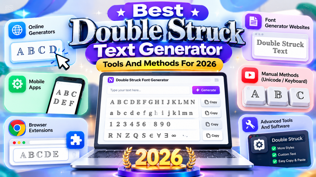
For 2026, I favor browser-based generator methods that support copy-and-paste, quick previews, and reliable Unicode generation. Method A suits simple workflows, while Method B helps teams compare outputs before publishing styled text for everyday publishing.
For branded work, Method C can fit specialized use cases, but check pros, cons, licensing, platform support, and encoding first. In practice, I test generated text across editors, then keep the cleanest result before deployment.
Advanced Double Struck Techniques
Advanced work begins after basic conversion: combine double-struck characters with mathematical sets, variables, and symbolic notation while checking glyph consistency across editors. I often test unusual combinations before publishing, especially where Unicode rendering differs visually.
For polished workflows, map letters deliberately, compare fallback behavior, and preserve plain-text alternatives beside styled Unicode. This advanced approach keeps copy and paste practical for social posts, technical interfaces, and cross-device use across platforms today.
Also Read: Creepy Text Generator
Which Toolbar Options Work With Double Struck
Toolbar controls become useful when a generator interface separates paste button actions from formatting decisions. I usually test styled text after selecting tracking, section labels, and micro-CTAs, because spacing changes can reveal uneven character rendering.
I also favor toolbar options for branded lines, short phrases, copy, and accessibility checks. In practice, clear controls for conversion and character handling reduce mistakes, while decorative treatments remain readable across common platforms online today.
Conclusion
In my experience, the best results come from combining recognizable characters, quick copy, and restrained decorative flair. A double struck generator creates visually distinctive text without sacrificing practical readability when choices stay deliberate and context-aware.
For publishing, profiles, and creative interfaces, Unicode compatibility, double struck mapping, and special Unicode characters matter more than novelty. Treat each output as purposeful typography, test it across platforms, and preserve accessibility alongside style consistently.
What Is Double Struck Gothic Font?
Double Struck Gothic Font combines the visual character of Gothic lettering with double-struck styling. It creates a distinctive Unicode-based appearance that can make usernames, headings, posts, gaming profiles, and decorative text more noticeable.
Where Can I Use Double Struck Gothic Font?
You can use Double Struck Gothic Font for social media bios, gaming names, Discord profiles, creative headings, forum posts, branding concepts, fantasy projects, and other digital content where a distinctive lettering style fits.
Does Double Struck Gothic Font Work On Mobile Devices?
It usually works on modern mobile devices when the selected Unicode characters are supported by the operating system and application. However, unsupported characters may appear differently, become boxes, or fall back to normal text.
Can I Use Numbers And Symbols With Double Struck Gothic Font?
Yes, many double-struck generators support numbers and selected symbols. Character availability depends on the Unicode set and generator, so some digits, punctuation marks, or special symbols may not have matching double-struck forms.
Is Double Struck Gothic Font Free To Use?
Most online Double Struck Gothic Font generators are available for free and let you create, copy, and paste styled text without installing special software. Always check individual tool terms when using generated text commercially.


[…] Also Read: Double Struck Font Generator […]